Show your customers their design on the product: a 3D model, a folded leaflet, a booklet or a flat sheet.
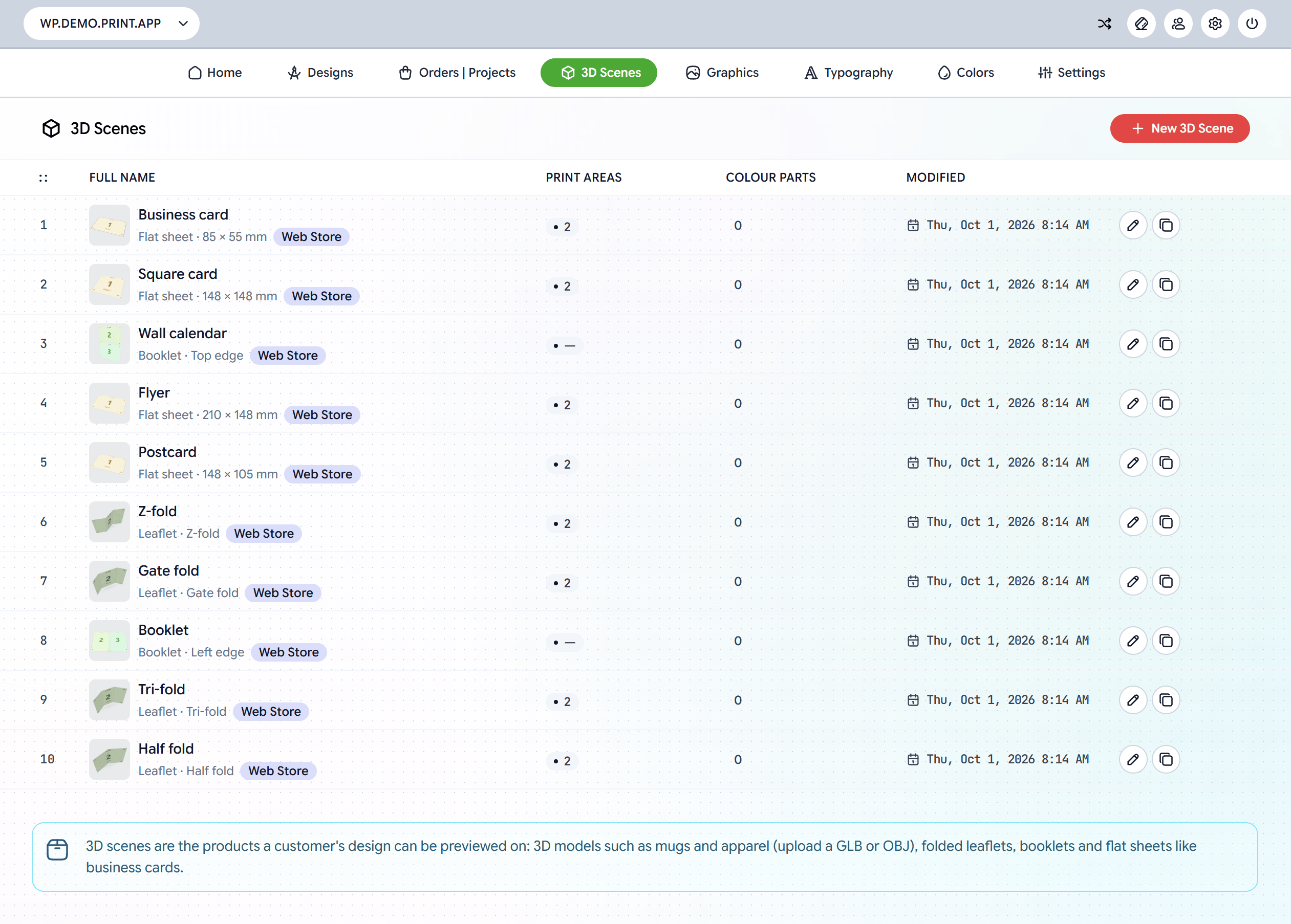
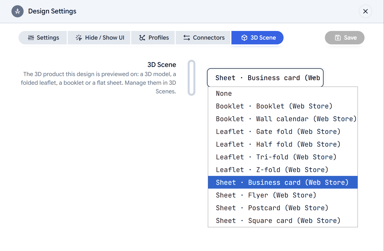
A 3D Scene is the product a customer’s design is shown on. When a design has a scene, the editor’s preview shows the customer’s pages on that product instead of as flat pages, and the product page shows it too once they save.Scenes live in 3D Scenes in your admin. You link a scene to a design in its Design Settings.
Your 3D Scenes page comes with ready-made scenes marked Web Store:
Kind
Web Store scenes
Folded leaflet
Half fold, Tri-fold, Z-fold, Gate fold
Booklet
Booklet, Wall calendar
Flat sheet
Flyer, Postcard, Business card, Square card
Use them as they are, or open one and change it. Saving an edited Web Store scene gives you your own copy, marked Customized, and your designs use it from then on.A 3D product always starts from your own model.
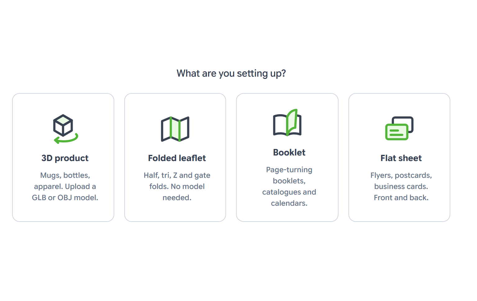
Pick 3D product, Folded leaflet, Booklet or Flat sheet, and give the scene a Title.
3
Set up the product
Fill in the cards on the right. They depend on the kind, as described below. The preview on the left updates as you go.
4
Check it with your own art
The preview starts with a numbered test pattern, so you can see which page lands where and which way is up. Use the buttons under the preview to try real artwork, and Test pattern to go back.
5
Save
Click Save. The thumbnail on the 3D Scenes page is taken from the start view.
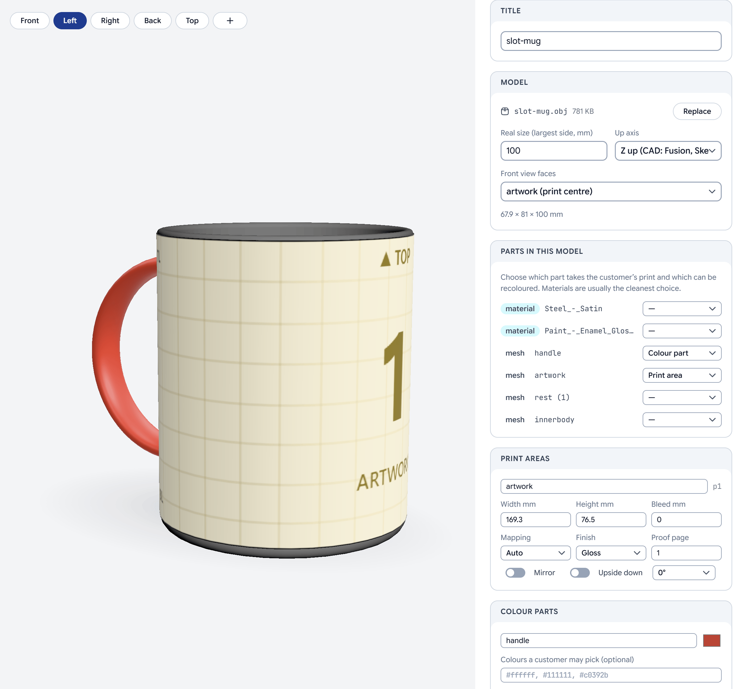
Drop a GLB or OBJ file on the preview, or choose one. GLB works best: one file with its materials. For OBJ, add its .mtl file too. Convert FBX files to GLB first. Models can be up to 60 MB.
2
Size and orientation
In the Model card, set:
Real size (largest side, mm), so the print lands at its true size.
Up axis: Y up for glTF and most tools, Z up for CAD tools such as Fusion or SketchUp.
Front view faces: the centre of a print area, or the model’s own front.
3
Mark the parts
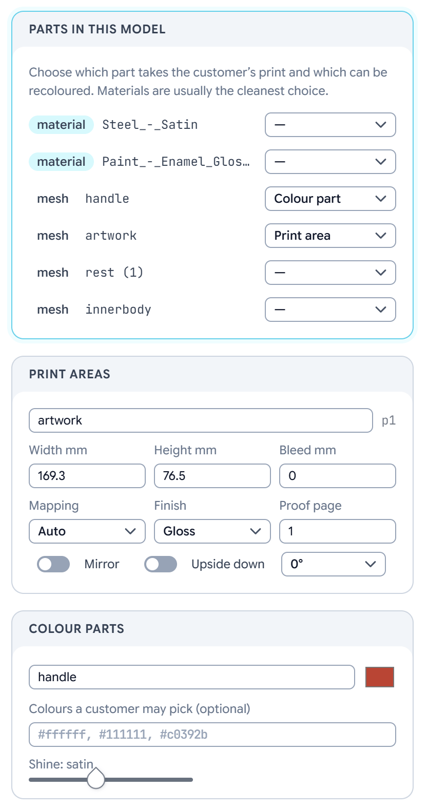
Parts in this model lists the model’s meshes and materials. Set each one to Print area, Colour part or leave it at —. Materials are usually the cleanest choice.
4
Set up each print area
Each print area has these settings:
Width mm, Height mm and Bleed mm: the printed size. When the surface measures differently, the studio offers Surface measures … use to take the model’s size.
Mapping: how the design is laid on the surface. Auto picks for you; Wrap (cylinder) goes round mugs and bottles; Flat projects straight on; Model’s own UVs keeps the model’s mapping.
Finish: Gloss, Silk, Matte or Uncoated.
Proof page: which page of the design this area shows.
Mirror, Upside down and a rotation, for when the design comes out the wrong way.
5
Colour the other parts
Under Colour parts, give each part its colour and its Shine.
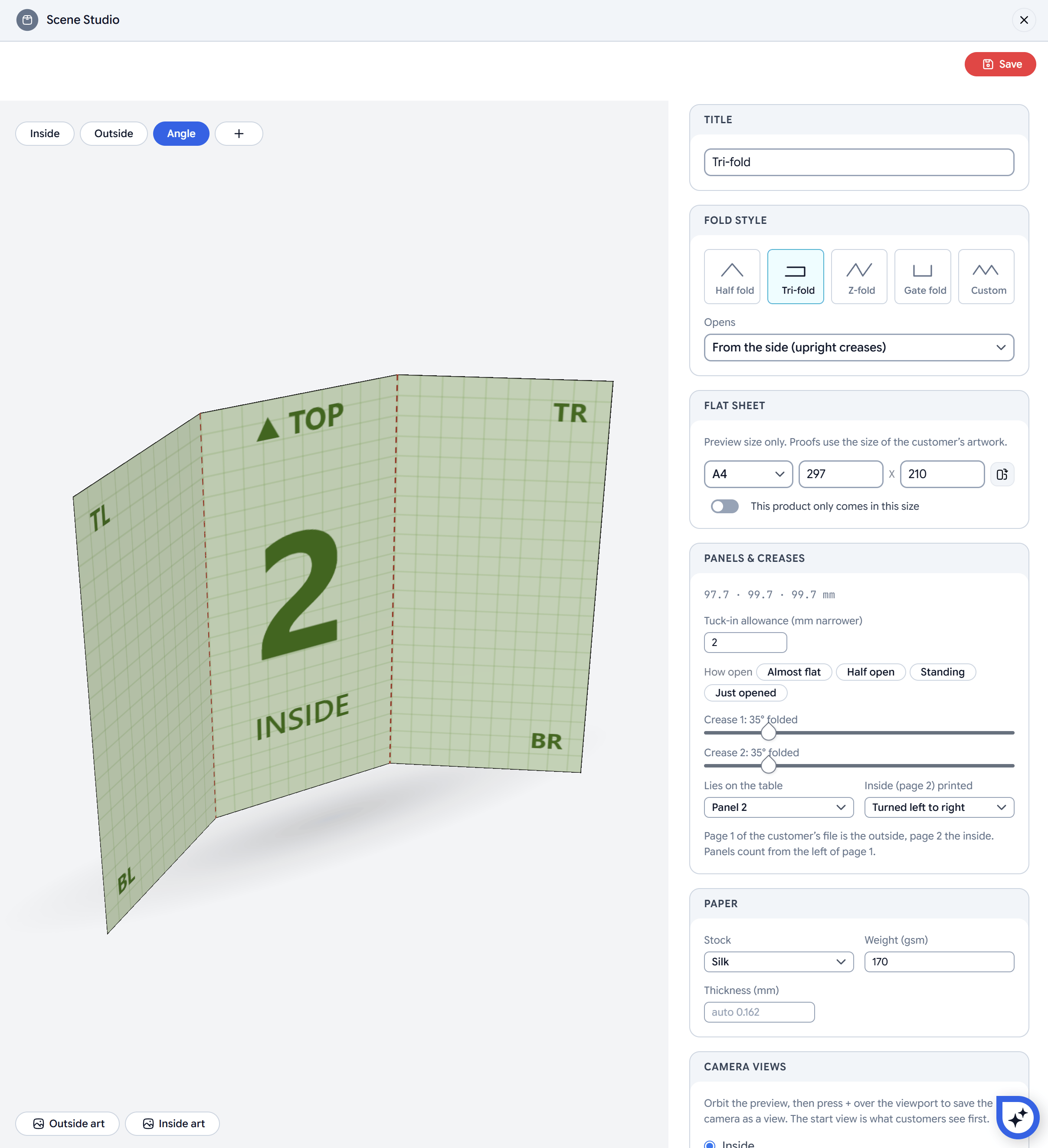
Fold style: Half fold, Tri-fold, Z-fold, Gate fold or Custom. Opens sets whether it opens from the side (upright creases) or from the top (level creases).
Flat sheet: the unfolded size, from a list (A4, A3, A5, US Letter, US Legal, Tabloid) or typed in. It is for the studio preview only: customers see the leaflet at the size of their design, unless you turn on This product only comes in this size.
Panels & creases:
Custom lets you set each panel’s width.
Tri-folds and gate folds have a Tuck-in allowance, the amount the inner panels are narrower so they fold inside.
How open sets every crease at once (Almost flat, Half open, Standing, Just opened), and a slider per crease fine-tunes it.
Lies on the table picks the panel that stays still.
Inside (page 2) printed sets whether the inside is Turned left to right or Tumbled top to bottom.
Paper: see Paper. The leaflet’s Paper card also has Edges.
Page 1 of the design is the outside and page 2 the inside, unless you supply a side. Panels count from the left of page 1, or from the top when the leaflet opens from the top.
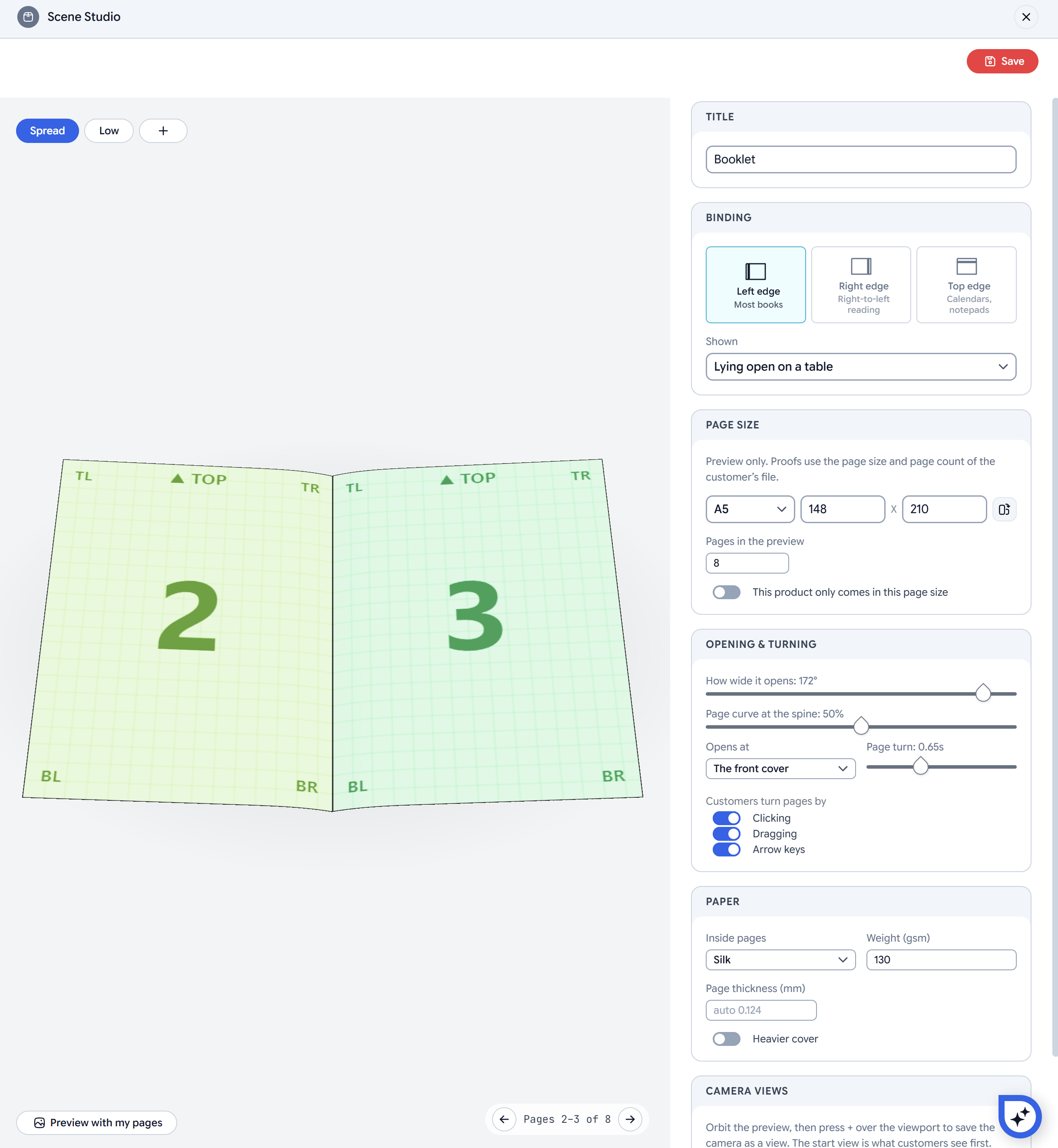
Binding: Left edge for most books, Right edge for right-to-left reading, or Top edge for calendars and notepads. Shown sets whether it lies open on a table or stands up.
Page size: one page’s size, from a list (A4, A5, A6, US Letter, Half Letter, Square 210) or typed in, and Pages in the preview. Both are for the studio preview only: customers see their design’s page size and page count. This product only comes in this page size fixes the size; the page count still comes from the design.
Opening & turning:
How wide it opens, and the Page curve at the spine.
Opens at: the front cover or the first spread.
The Page turn speed.
Customers turn pages by clicking, dragging or the arrow keys. Turn each one on or off.
Paper: the inside pages’ stock, weight and Page thickness. Turn on Heavier cover to give the cover its own stock and weight.
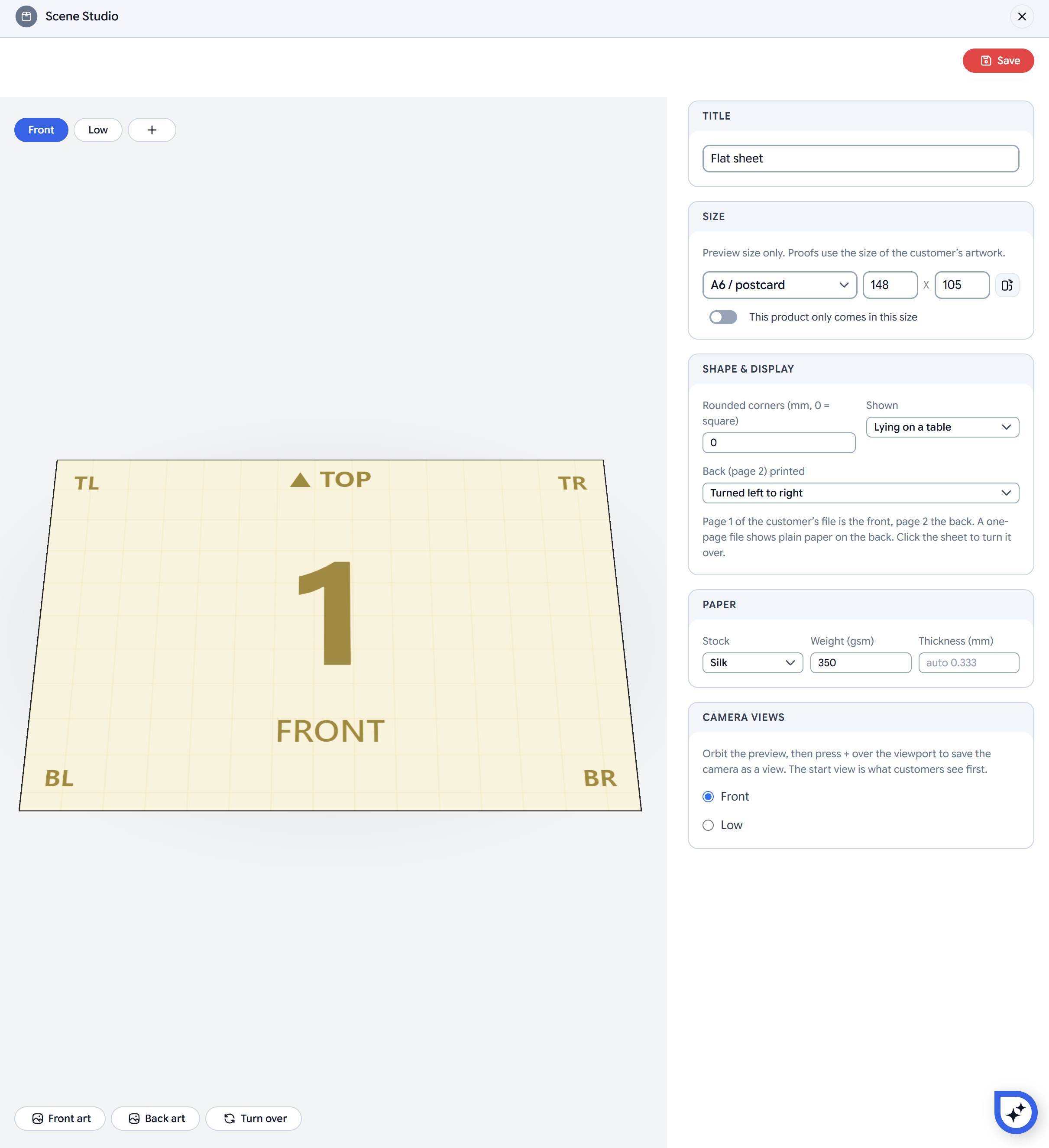
Size: from a list (business cards, A6 and 6 × 4 in postcards, DL, A5, A4, US Letter, Square 148) or typed in. It is for the studio preview only, unless you turn on This product only comes in this size.
Shape & display:
Rounded corners in mm, with 0 for square corners.
Shown: lying on a table or standing up.
Back (page 2) printed: turned left to right or tumbled top to bottom.
Page 1 of the design is the front and page 2 the back, unless you supply a side. A one-page design shows plain paper on the back. Customers click the sheet to turn it over.
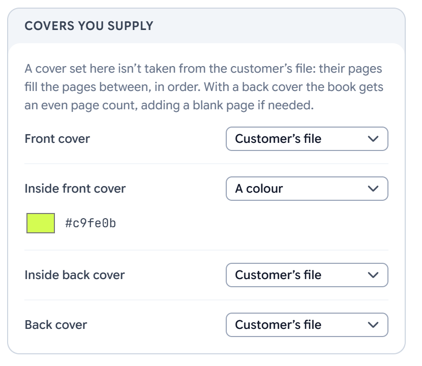
Some products have a side the customer doesn’t design: a single-sided business card with a green back, a leaflet with a printed order form inside, or a booklet whose back cover is always the same. Set those sides in the Sides you supply card (Covers you supply for booklets), and the customer only designs the rest.Each side is one of:
Customer’s file: the default. The side shows a page of the customer’s design.
A colour: the whole side in one colour.
An image: a PNG, JPEG or WebP up to 4 MB. Fills the side covers it edge to edge, cropping what doesn’t fit. Fits on a colour shows the whole image on a background colour you choose.
The design’s pages fill the sides you don’t supply, in order:
Product
You supply
The design’s page 1 goes on
Flat sheet
The back
The front
Flat sheet
The front
The back
Folded leaflet
The outside
The inside
Folded leaflet
The inside
The outside
A flat sheet or leaflet always keeps one side for the customer’s design, so once one side is supplied the studio won’t let you supply the other.
Covers you supply, with the inside front cover set to a colour
A booklet can supply any of its four covers: the front cover, the inside front cover, the inside back cover and the back cover. They stay in their places, and the design’s pages fill the pages between them in order. For example, with a supplied front and back cover, a 6-page design becomes an 8-page booklet: your front cover, the customer’s pages 1 to 6, then your back cover.A back cover (or an inside back cover) always lands on the back of the last sheet. When the page count would be odd, a blank page is added before it.
Sides you supply appear in the 3D view only. The flat Pages view and the print file are the customer’s pages as designed.
Flat sheets and folded leaflets can show painted edges, like edge-painted business cards. Set Edges to Painted (a colour) and pick the colour, or leave it on Paper. On a flat sheet the whole edge is painted, rounded corners included. On a leaflet only the outer edges of the sheet are painted, and the creases stay paper.
The edge is as thick as the paper, so a colour on ordinary card is a hairline. Set Thickness (mm) to your stock’s real caliper, for example 1.2 mm for a thick painted-edge card, and the edge shows as it will look in the hand.
Each scene comes with camera views, shown as buttons above the preview. To add your own, turn the preview to the angle you want and press +. In the Camera views card, choose the start view, which is what customers see first and what the thumbnail shows. You can rename or delete the views you added. Customers switch between the views with the same buttons.
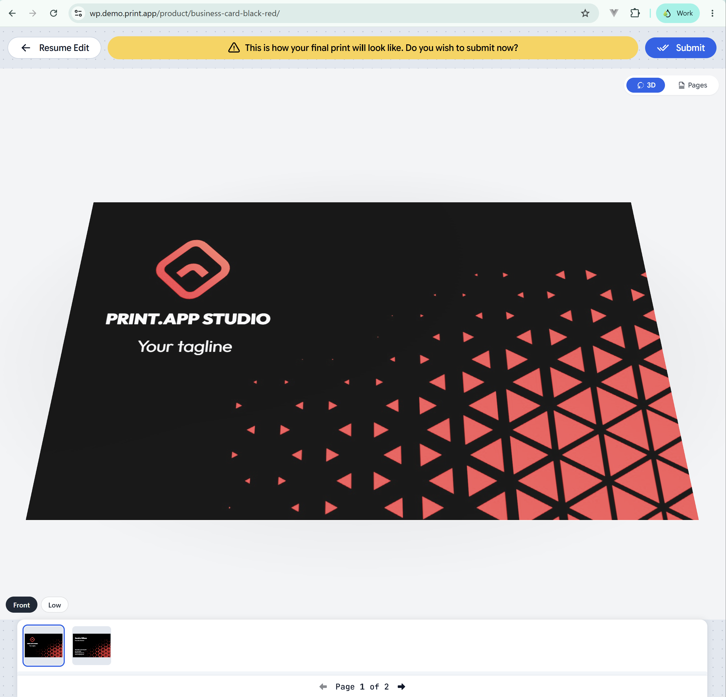
When the customer clicks Preview, the editor shows their pages on the product instead of as flat pages. A 3D / Pages switch in the top right goes back to the flat pages and returns to 3D.
The editor's preview on a business card
The 3D view and the editor’s pages stay together. Turning a booklet’s page moves the editor to that page, and picking a page in the editor turns the booklet or flips the sheet to it.With the Mini display mode, the editor stays on the product page after the customer submits, still showing the design in 3D.
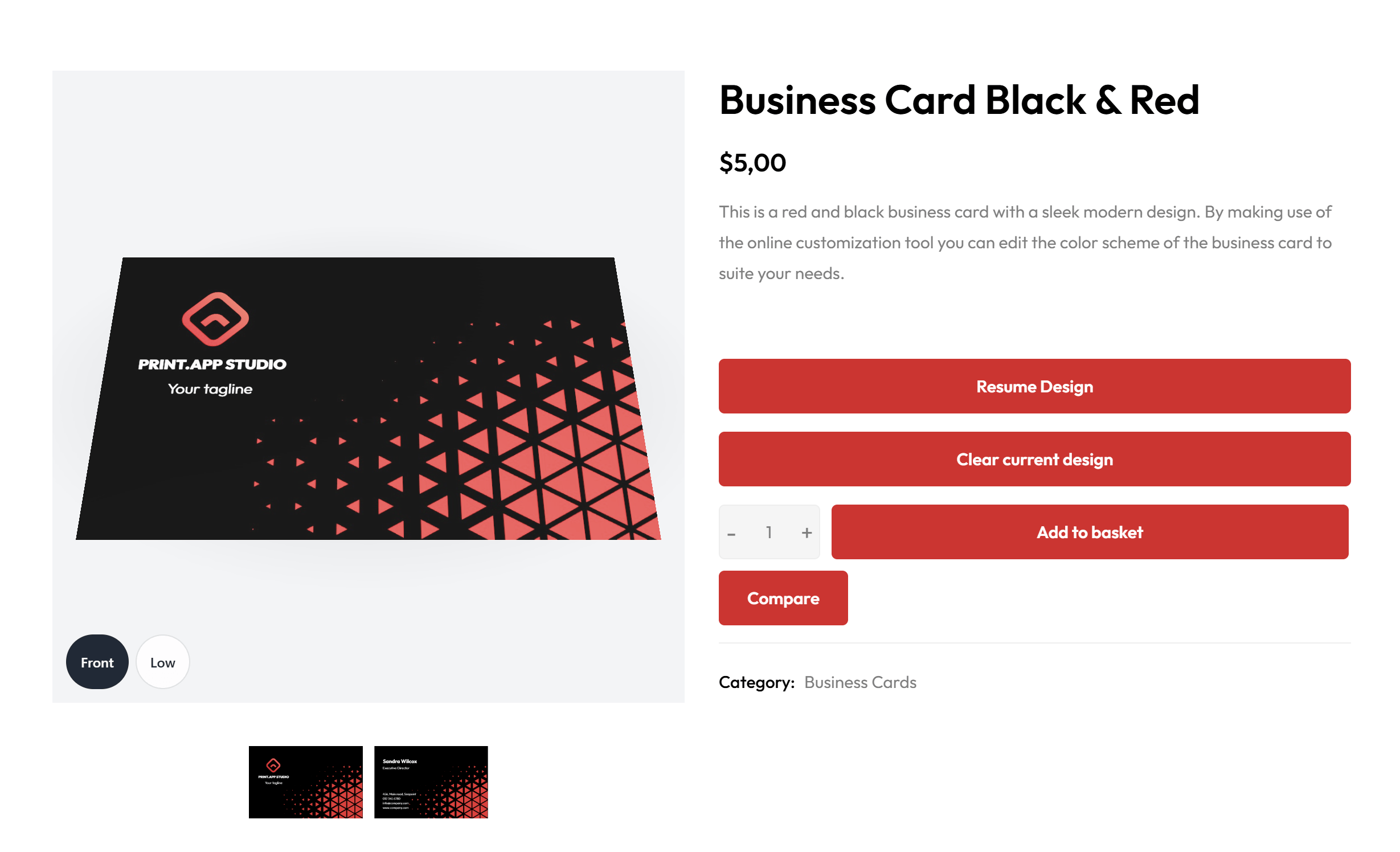
When the customer saves their design, the product’s image gallery shows it on the product. The thumbnails underneath turn the booklet or flip the sheet to that page.
The product page after the customer saves
The gallery shows the design as it was when the customer saved. Cart thumbnails, order pages and emails keep showing the flat page images.
The editor and the product page use the design’s first page for the size of leaflets, booklets and sheets, unless the scene has a fixed size. 3D products always keep the size set in the scene.
Mail Merge designs keep the flat preview, since it steps through every record.
If the customer’s browser can’t show 3D, or a page can’t be drawn, the flat pages are shown instead.
The product page gallery needs Retain Product Images turned off in Settings, since that setting keeps your own product images in place.
The 3D gallery shows right after the customer saves. If they reload the product page, the gallery shows their saved page images.
When a product has several designs, for example one per variant, each design shows its own scene.