> ## Documentation Index
> Fetch the complete documentation index at: https://print.app/docs/llms.txt
> Use this file to discover all available pages before exploring further.
# Stationery Products
> Practical patterns for Business Cards, Flyers, Letterheads, and more—personalization that prints perfectly.
Stationery is where personalization meets brand consistency. From business cards and letterheads to flyers and compliment slips, Print.App gives you the building blocks to let customers self‑serve while you keep production predictable.
New to creating Designs? You can skim this guide first, then explore specific how‑tos in the Designs section.
## What counts as “stationery” here?
* Business Cards (single or double‑sided)
* Letterheads and Continuation Sheets
* Compliment Slips, Envelopes
* Flyers and Handouts (single/multi‑page)
* Appointment Cards, ID Cards, Name Badges
Each of these shares two needs: on‑brand layouts and quick, guided personalization.
## Core building blocks you’ll use
* Smart Texts for names, roles, contact lines and addresses
* Locked artwork layers (logos, backgrounds) to enforce brand rules
* Optional QR Codes for fast contact or landing page access
* Presets to control typography or field options (e.g., job titles)
* Page Selector for brochures/menus that can grow with content
* Mail Merge for bulk team cards or serialized items
Relevant docs:
* QRCode
* Text Presets
* Page Selector
* Mail Merge
* Variation Datasource
## Patterns that work well
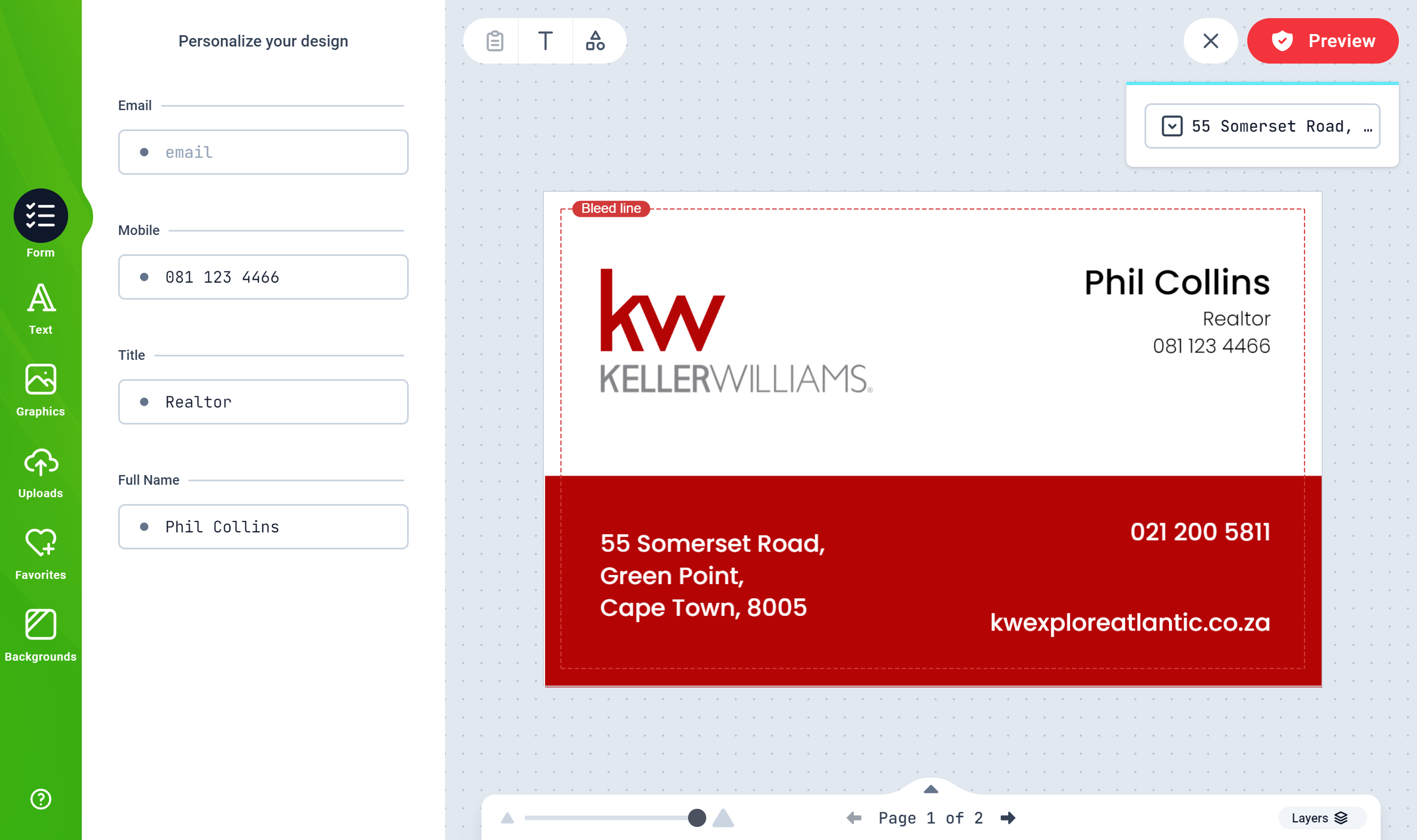
### Business Cards
Keep the customer edit area simple and brand‑safe:
* Front: name, title, phone, email, URL; logo locked; brand color blocks
* Back: optional brand pattern, QR Code or campaign CTA
* Offer single vs double‑sided variants; show the right page(s) by default
Team cards? Combine your Design with Mail Merge. Upload a CSV with staff details to generate a single PDF containing every person’s card.
If you list “Single‑Sided” vs “Double‑Sided” as product options, you can pre‑show the relevant page(s) using the Page Index connector. See Connectors.
### Flyers & Handouts
Flyers benefit from guided flexibility:
* Define safe zones for headlines, body copy, price lists, and images
* Add optional image drop areas so customers can swap artwork without breaking layout
* For multi‑panel menus or service lists, let users add pages with Page Selector
If you routinely run versions across locations, connect your Design to a CSV via Variation Datasource to swap addresses, hours, or localized promotions.
### Letterheads & Compliment Slips
These prioritize brand control and clean output:
* Lock logos and header/footer artwork; expose address/phone/email as Smart Texts
* Use Presets for department names or office locations to avoid typos
* Keep ample safe area for office printers (no critical text too close to edges)
 ## QR Codes that actually get used
QRs shine on small formats (cards, flyers) where space is tight:
* Encode vCard, URL, or tracking links
* Bind QR content to Text values (e.g., website or address) to keep it in sync
* Keep clear space around the QR for reliable scanning
See QRCode for binding a QR to text fields.
## Guardrails for reliable print
* Set bleed and margins in your Design; don’t rely on users to “guess” safe areas
* Minimum type sizes: ensure contact details remain readable at final size
* Use consistent line weights and color contrast; thin lines can disappear
* Place critical info away from drill/bind areas when applicable
Review global Designer lines and snapping options under Settings → Designer Settings to help users stay within safe zones.
## Scaling the catalog without chaos
* Create size‑specific Designs (e.g., A6 card vs US 4×6 in) rather than stretching
* Duplicate a master Design and swap brand themes/colors for sub‑brands
* Use Mail Merge for team sets and Variation Datasource for location‑based content
## Customer experience tips
* Keep forms short; most customers want quick edits and a live preview
* Pre‑fill common fields where possible (e.g., website domain)
* Provide clear page names like “Front” and “Back”
* Offer sensible defaults for QR visibility and back design options
## Quick launch checklist
* Safe areas and bleed configured; logos locked
* Text fields titled and grouped logically in Forms
* Optional back page (and variants) prepared
* QR Codes, if used, test‑scanned from a printed proof
* PDF export verified for line weights and small type
## Related
* QRCode
* Text Presets
* Mail Merge
* Page Selector
* Connectors
* Design Editor
## QR Codes that actually get used
QRs shine on small formats (cards, flyers) where space is tight:
* Encode vCard, URL, or tracking links
* Bind QR content to Text values (e.g., website or address) to keep it in sync
* Keep clear space around the QR for reliable scanning
See QRCode for binding a QR to text fields.
## Guardrails for reliable print
* Set bleed and margins in your Design; don’t rely on users to “guess” safe areas
* Minimum type sizes: ensure contact details remain readable at final size
* Use consistent line weights and color contrast; thin lines can disappear
* Place critical info away from drill/bind areas when applicable
Review global Designer lines and snapping options under Settings → Designer Settings to help users stay within safe zones.
## Scaling the catalog without chaos
* Create size‑specific Designs (e.g., A6 card vs US 4×6 in) rather than stretching
* Duplicate a master Design and swap brand themes/colors for sub‑brands
* Use Mail Merge for team sets and Variation Datasource for location‑based content
## Customer experience tips
* Keep forms short; most customers want quick edits and a live preview
* Pre‑fill common fields where possible (e.g., website domain)
* Provide clear page names like “Front” and “Back”
* Offer sensible defaults for QR visibility and back design options
## Quick launch checklist
* Safe areas and bleed configured; logos locked
* Text fields titled and grouped logically in Forms
* Optional back page (and variants) prepared
* QR Codes, if used, test‑scanned from a printed proof
* PDF export verified for line weights and small type
## Related
* QRCode
* Text Presets
* Mail Merge
* Page Selector
* Connectors
* Design Editor